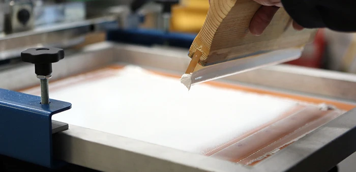
If you’re running a screen printing shop, chances are white ink is on your press every single day. It’s the workhorse of the industry—and also one of the trickiest inks to dial in just right. Whether you’re laying down a basic logo or building out a detailed print, getting that crisp, bright white is a skill that separates the pros from the rest.
Most shops are already familiar with the classic PFP method—Print, Flash, Print—to build up white opacity. It’s a solid technique, and one we use constantly. But there’s another way to achieve even better results (and faster production): using multiple white screens on press.
Why Use Multiple White Screens?
When you use multiple screens instead of one screen with multiple strokes, you can build opacity without rotating the press for each flash. This means you eliminate a full cycle of indexing, flashing, and waiting—drastically increasing your production speed. For high-volume shops or time-sensitive jobs, this time savings is a game-changer.
Plus, by varying the mesh counts across your screens, you gain more control. You can lay down heavier ink where needed, keep fine details sharp, and even soften the overall hand feel. This not only looks better but also feels better—something your customers will notice.
Scenario 1: Bold Block Text
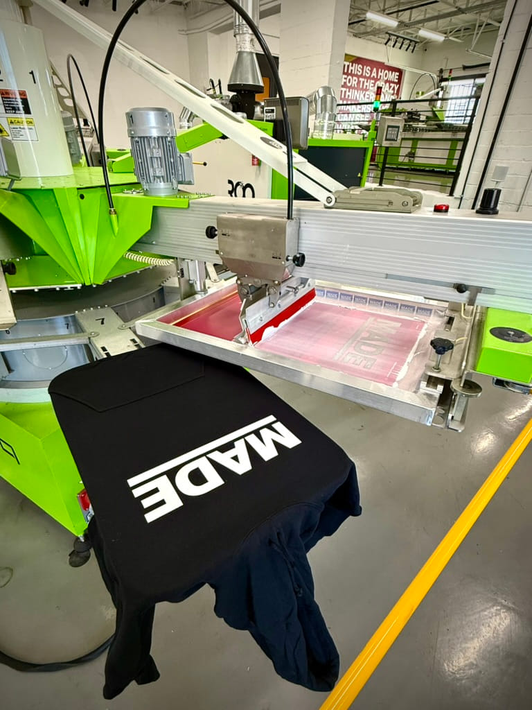
If your design is all about large, solid white shapes—like big type or logos—here’s a simple, effective setup:
- First screen: 110 or 140 mesh – Lays down a thick, solid base
- Second screen: 180 mesh – Smooths things out and builds opacity
- Third screen: 230 mesh – Adds the final polish
This sequence helps stack opacity without overloading any single screen. You’ll get a bright, opaque print with a much softer hand than if you just ran two 140s.
Just make sure to choke your top two whites—just like you would with an underbase—to prevent edge gain. And in this scenario, the ink is used straight from the bucket, no modification needed.
Scenario 2: Fine Detail and Texture
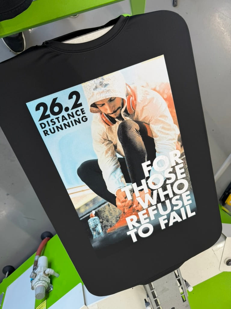
Now let’s say you’re working with a print that’s more intricate—maybe something with gradients or textures. Here, your approach flips a bit:
- First screen: 230 mesh with reduced white ink – This lets ink shear nicely and keeps your fine lines crisp
- Second screen: 158 or 180 mesh with full-opacity white – Lays down your primary brightness
- Third screen (optional): 230 mesh – Use this to pop highlights or enhance detail
This method lets you play with your art across screens—adding or omitting information to build texture, tones, and depth. You’re still stacking whites, but the opacity is mainly built by the second and third screens, with the first acting as a soft base layer.
Putting It All Together
No matter the approach, stacking whites creates brightness—and the base layer is key. Once that first layer is down, you’re not printing on fabric anymore—you’re printing on ink. This makes everything that follows pop harder and stay more consistent.
Here’s the TL;DR:
- Use multiple screens to PFP without extra press rotations
- Choose varying mesh counts for better coverage, detail, and hand feel
- Save significant production time by skipping flash rotations
- Get cleaner, brighter prints with softer finishes
- Use artwork choking on upper whites to avoid blurry edges
Final Thoughts
Bright whites can set your shop apart. They’re a mark of quality, experience, and attention to detail. Whether you’re printing a hundred shirts or a thousand, knowing how (and when) to stack whites is a huge asset for quality and speed.
Want help dialing in your press setup for multi-white jobs? We’re always down to talk shop.