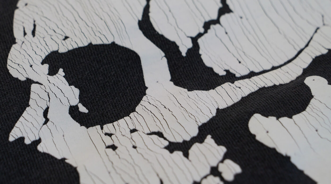
Print’s Not Dead—and for this one, we wanted the print itself to help make that statement.
Our punk-rock-inspired design was all about creating something that didn’t look brand new. We wanted a heavy, cracked print that felt like it could have come off a vintage band tee that had already spent years being worn, washed, and abused.
To get there, we built the print around Avient Infinite FX Brittle Base, using multiple layers of ink to create a deliberately heavy deposit that we could crack after curing.
And because a vintage print deserves the right shirt, we printed the design on a BELLA+CANVAS 4810GD in Washed Black. The heavyweight, garment-dyed tee already has a soft, worn-in feel and washed appearance right out of the gate, making it a great canvas for what we were trying to accomplish.
Starting With the Underbase
The print starts with a 110 mesh SAATI Hi-Dro screen using Avient Infinite FX Brittle White as our underbase.
We print the underbase with two print strokes, then send it underneath the flash followed by a cool-down station.
That flash-and-cool sequence is important throughout this print. We're building several substantial layers of ink, so we want each layer ready to accept the next one before continuing.
Once the underbase is flashed and cooled, it's time to start stacking our top colors.
Building the Red and Warm Grey
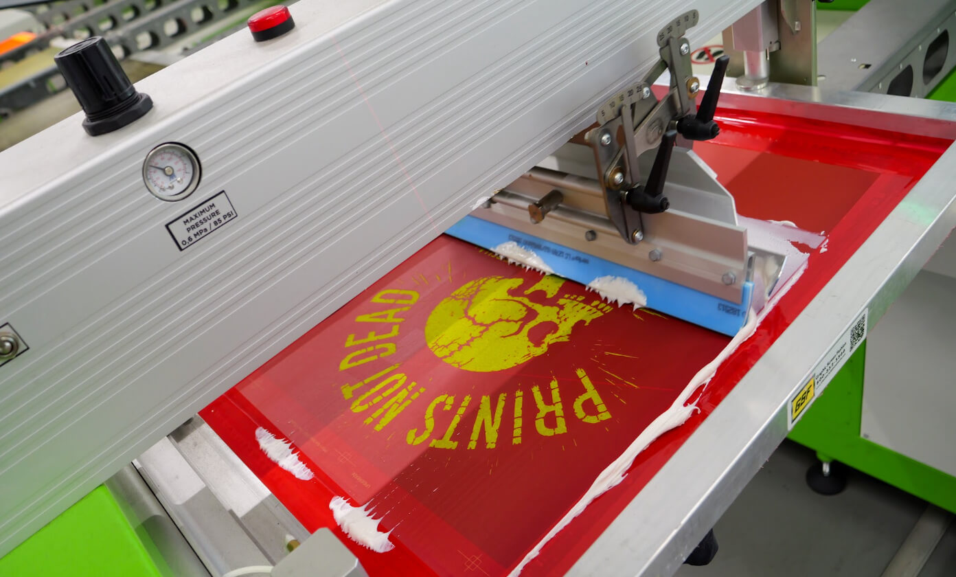
Our first top color is 711 C Red, printed through an 81 mesh SAATI Hi-Dro screen.
The red is mixed using Avient Brittle Base and the C3 Color Mixing System. Just like the underbase, we hit it with two print strokes.
Then it's back through the flash and cool.
Next comes Warm Gray 1, also mixed with Brittle Base and the C3 system and printed through an 81 mesh SAATI Hi-Dro screen.
Two strokes. Flash. Cool.
But we're not done.
We come back with another 81 mesh screen of 711 C Red, putting down two more strokes before flashing and cooling again.
Finally, we hit the design with another 81 mesh screen of Warm Gray 1.
So our complete print sequence looks like this:
Brittle White Underbase → Flash → Cool → 711 C Red → Flash → Cool → Warm Gray 1 → Flash → Cool → 711 C Red → Flash → Cool → Warm Gray 1
Why print the same colors twice instead of stopping after the first pass?
Ink deposit.
We're Trying to Put Down A LOT of Ink
Normally, a big part of screen-printing technique is controlling ink deposit. With this print, we're deliberately pushing it in the opposite direction.
We want a heavy ink film.
All of the top-color screens are 81 mesh SAATI Hi-Dro, and every screen in the design is printed with two print strokes using a 65/90/65 triple-durometer squeegee at 40 PSI and approximately a 15–20° angle.
Those settings are intentional. We're trying to increase the amount of ink we're putting onto the garment and build some serious thickness.
Layer by layer, we're creating the ink film that will eventually give us the effect we're after.
Then We Crack It
Here's where the fun starts.
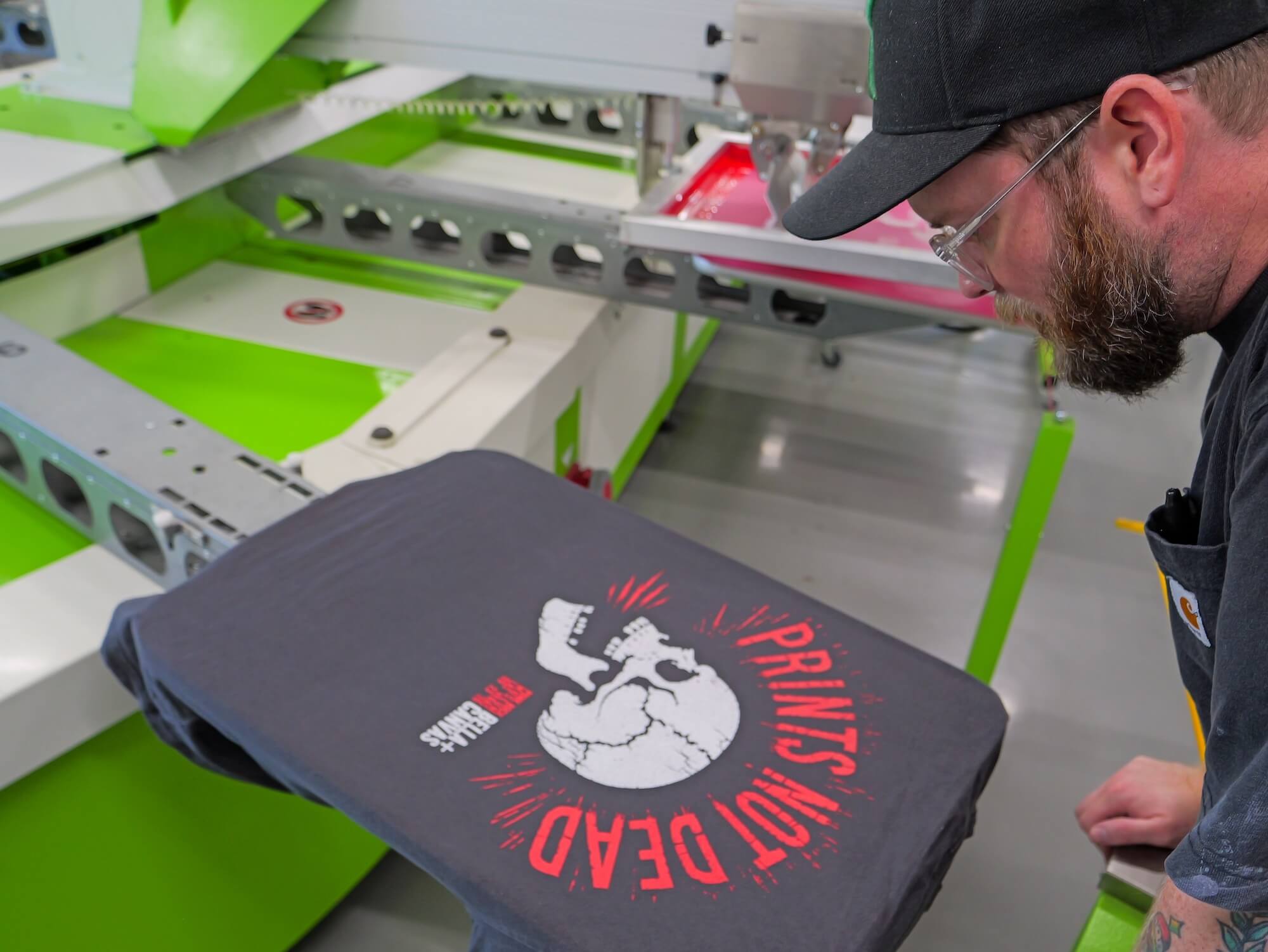
Once that heavy ink deposit is built and the print is cured, we crack it, physically pulling the print to make the ink crack apart.
The Avient Brittle Base helps us create that cracked appearance while still producing a fully cured print that isn't simply going to flake off the shirt during normal wash cycles.
Instead, the cracking becomes part of the design.
Even better, the print isn't necessarily finished aging when it leaves our shop. As the shirt gets worn and washed, the print can continue to crack and distress, adding more character over time.
That's exactly what we wanted.
The Washed Black garment, heavyweight feel, intentionally heavy ink deposit, muted colors, and cracked surface all work together to create something that feels less like a freshly printed graphic tee and more like an old favorite.
And that's the cool part about specialty screen printing.
Sometimes we're trying to make the cleanest, smoothest, most technically perfect print possible.
Other times, the imperfection is the point.
Print’s Not Dead.