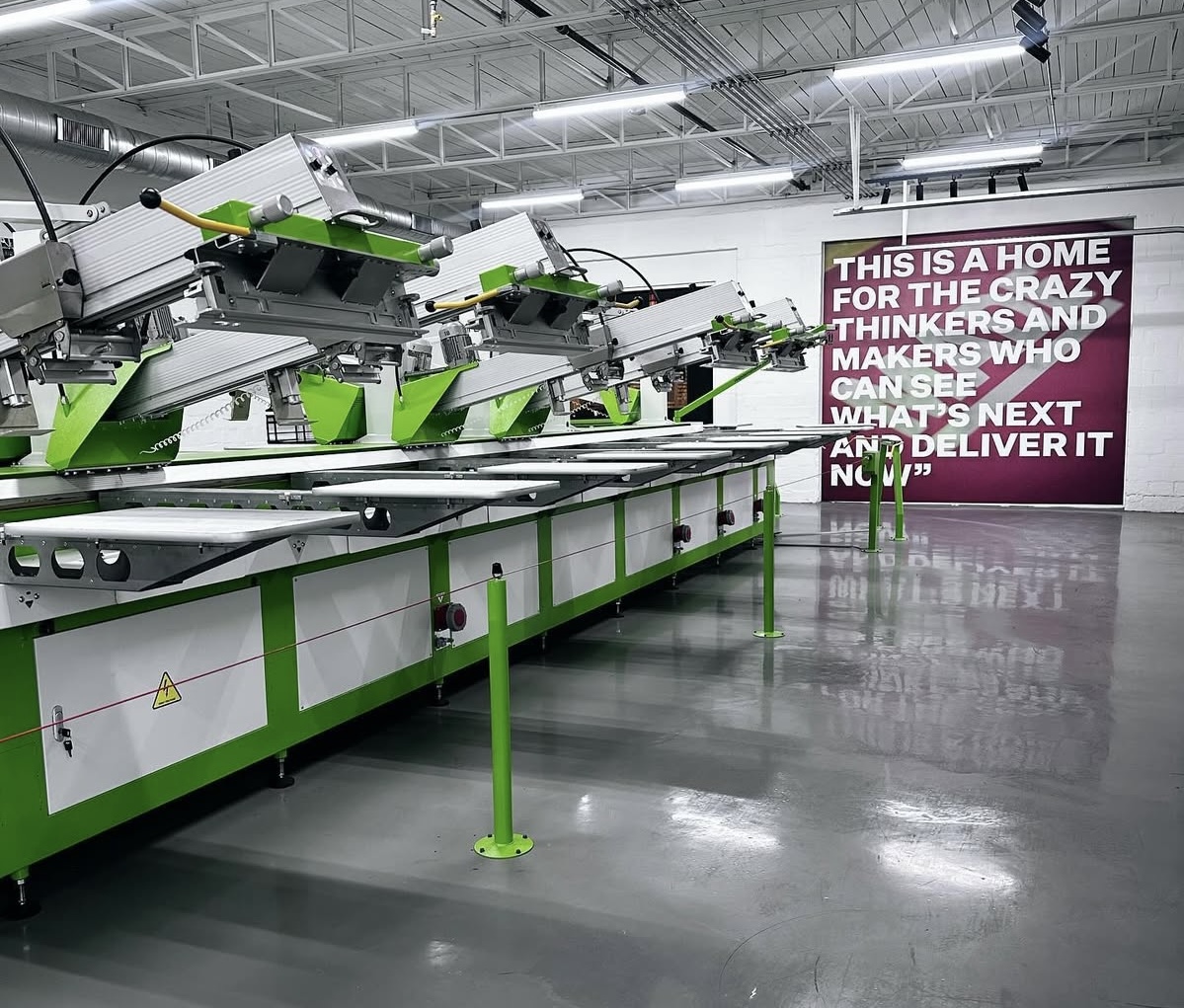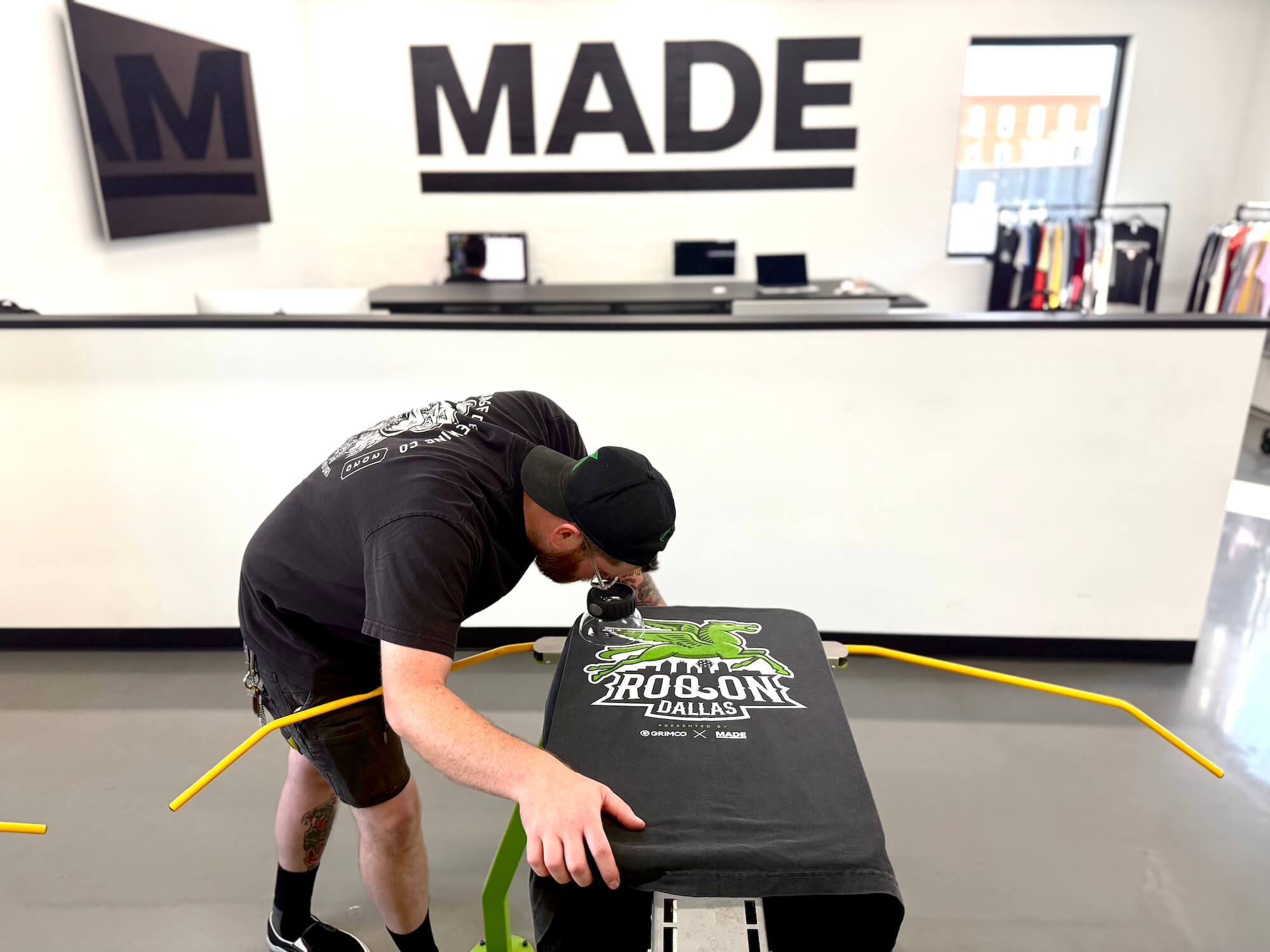
At MADE Laboratory, every project is a chance to blend craft, technology, and storytelling through screen printing. For the ROQ On Dallas party — happening after the Impressions Dallas show — we wanted to make a shirt that feels like it belongs at a concert merch booth: bold, textured, and with a hand-feel that makes people want to wear it all weekend.
This breakdown isn’t just about what we did — it’s about the technical why behind each choice. From mesh counts to squeegee durometers, every detail matters when chasing a specific print feel.
The Design Vision
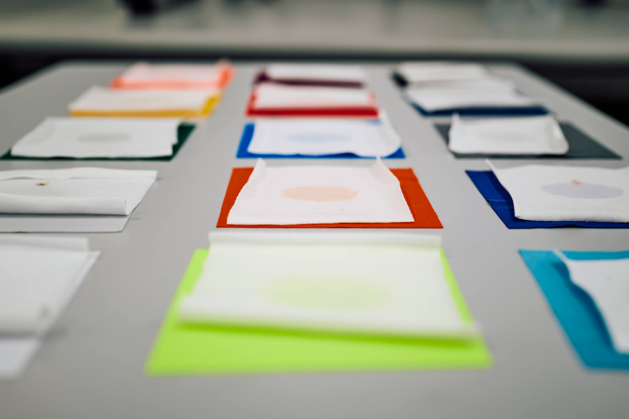
The design created by our friend Alyx Spurrier from Spurrier Design featured a distressed base with layered whites, topped by a Pegasus icon — a nod to Dallas’ oil industry heritage — in a loud, rock-inspired green (Pantone 376). To pull this off, we had to achieve:
- A soft-hand print that feels worn-in, not plastic.
- Crisp halftone textures that reinforce the distressed look.
- Bright whites and vivid color pop without adding unnecessary bulk.
This balance meant making careful technical decisions in every stage of the process.
Step 1: The Underbase
Specs
- Screen Mesh: 230 mesh
- Squeegee: 65/90/65 triple durometer, 5° angle
- Ink Mix: M3 White + 75% Finesse Base
- Halftones: 65 LPI
- Curing Tool: Stampinator (short dwell time)
Why It Matters:
- A 230 mesh is tight enough to hold halftones cleanly but still lays down enough ink for opacity.
- The triple durometer squeegee (softer edge with firm backbone) helps push more ink through fine mesh without over-depositing.
- Mixing M3 White with Finesse Base thins the ink body, reducing opacity slightly but dramatically softening the feel. This is crucial for distressed designs — you want ink in the shirt, not sitting stiffly on top.
- Running 65 LPI halftones introduces intentional texture — the shirt doesn’t look overly flat, but instead distressed and broken-in.
- The Stahls Hotronix Stampinator press smooths fibers and levels the ink, prepping the surface for the next screen while reducing fibrillation (no fuzzy fibers poking through later).
Step 2: Highlight Underbase White
Specs
- Ink: Rutland Street Fighter White + 20% Base
- Application: Selective areas only (not a full underbase)
- Flash Cure: Between colors
Why It Matters:
This isn’t just a second white — it’s a selective reinforcement. By targeting only the elements that need brightness, we control where contrast really pops.
Adding 20% base keeps this ink layer soft and creamy. Instead of doubling the thickness of the white, it’s more of a smoothing pass. Combined with a flash cure, this step locks in the highlight areas so they’ll stay crisp under the color pass.
Step 3: Pantone 376 Green (The Pegasus)
Specs
- Ink Color: Pantone 376 (custom ROQ party green)
- Design Element: Pegasus logo
Why It Matters:
Pantone 376 is not just “green” — it’s loud, sharp, and unapologetically bright. The Pegasus symbol connects to Dallas’ history, but in this palette, it transforms into something rebellious and modern.
Printing this over the stabilized whites ensures the green stays bright instead of dulling against the shirt’s base fabric. Without the staged underbase and highlight, this green would fall flat.
Step 4: Final White Top Layer
Specs
- Screen Mesh: 230 mesh
- Ink: Reduced M3 White
- Application: Over select highlights and halftones
Why It Matters:
This last pass ties everything together. By reducing the M3 White further, we ensure the ink lays smooth and breathable, while still holding halftones. The result: a shirt that is bright in the right places, soft to the touch, and textured enough to feel authentic.This is where print feel and aesthetics meet — retail-ready quality.

The Finished Print
By combining halftones, ink reduction, and layered whites, the print achieves three things:
- Visual Texture – distressed halftones give character.
- Soft Hand – heavy underbases are avoided, replaced by thinned, layered whites.
- Pop of Color – the ROQ-green Pegasus locks in the design’s identity.
It’s a shirt that looks vintage yet polished, soft yet vibrant — the exact balance we set out to achieve.
Takeaways for Printers
- Mesh counts matter. 230 mesh gives you halftone control without choking your ink flow.
- Ink reduction is your friend. Adding base not only softens the hand but changes how ink interacts with fabric.
- Selective whites > heavy underbases. Brightness comes from control, not bulk.
- Halftones aren’t just for photos. Use them to introduce texture, distress, and movement.
- Tools like the Stampinator add consistency by smoothing fibers and preventing long-term wash issues.